Virgin Wines
UX/UI Design
Virgin Wines, trusted by over 400,000 customers across the UK, was evolving and their website needed to evolve with them. After a major rebrand, they turned their focus to creating a more refined, engaging online experience. Together with a team of five designers, we sought to enhance their digital presence and make every part of the journey feel seamless and connected.
What I did: UX research, UI design
-
Virgin Wines was experiencing low engagement on their About Us and Events pages and a high drop-off rate during the checkout process, creating a need for improvements that aligned with their brand guidelines.
-
Clearer storytelling and a smoother checkout experience is crucial to boosting user engagement and retention.
-
We enhanced brand storytelling and streamlined the checkout process, resulting in a more engaging and user-friendly experience that stayed true to Virgin Wines’ brand.
Cluttered content creates lost users.
Analyzing the site revealed missing headings, weak structure, and confusing content. Users often turned to the help page, and 85% dropped off at checkout. Competitor research quickly showed what worked and what didn’t.
Insights to ideation
Inspired by the insights, I began sketching and exploring ways to bring more life into the experience. I believed that ideas like wine pouring animations, playful micro-interactions, and interactive cards could truly set Virgin Wines apart from their competitors and create a more memorable website experience.
Storytelling through design.
Drawing inspiration from the brand font “Joy,” the use of smooth curves in the design aimed to create an experience that felt light, natural, and effortless. To complement this, shades of red and pink were chosen, inspired by the variety of wines, bringing warmth and character to the overall visual experience.
Small interactions, big impact
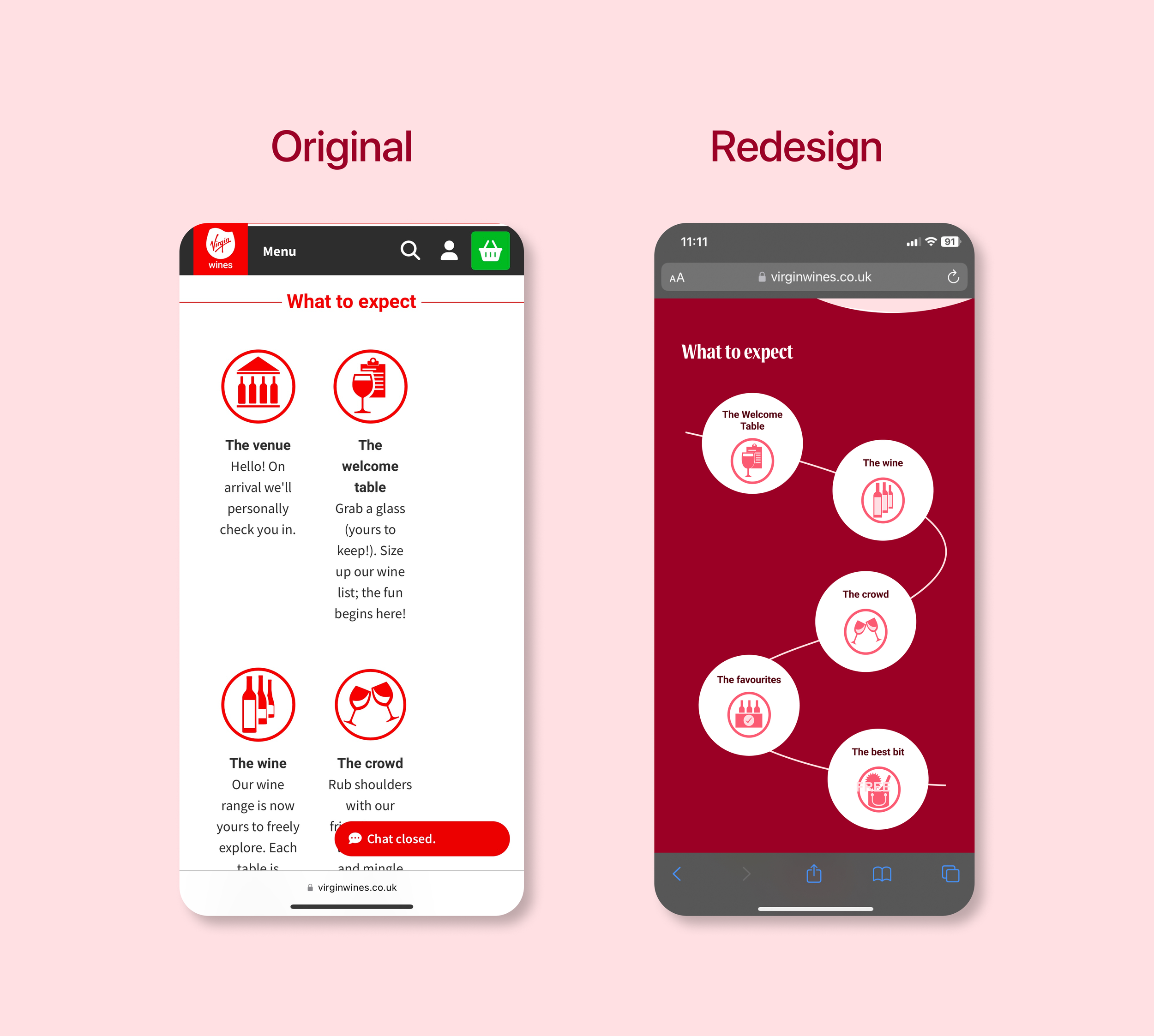
Users tap on each circle to reveal more information. This design choice aimed at reducing text clutter and create a cleaner, more minimal experience.
Pitching and presentation
I’m going to lie and say I was not nervous at first but eventually presented with confidence and had a overall fun experience.
Before and after comparisons
Beyond cleaning up the layout, I focused on making every Interaction and content shown more meaningful while staying true to the brand’s identity.


