
Halfords mobile checkout redesign
UX/UI Design
As part of a Foolproof industry challenge, I focused on improving Halfords’ mobile checkout experience - a key touchpoint in digital e-commerce. The goal was to streamline the process, enhance usability and drive better business outcomes.
-
The current experience presents usability and design issues that may cause users to abandon their purchase and lose trust in the brand, ultimately impacting sales performance.
-
Checkout requires high cognitive effort, making it a critical point where friction can easily disrupt the customer journey.
-
A streamlined, intuitive checkout experience aimed at making custom experience enjoyable while supporting better business outcomes.
About Halfords
Halfords is a UK retailer offering motoring and cycling products, with over 400 stores, the company also offers vehicle servicing, MOTs, maintenance, and repairs through its Autocentre network.
The research and context
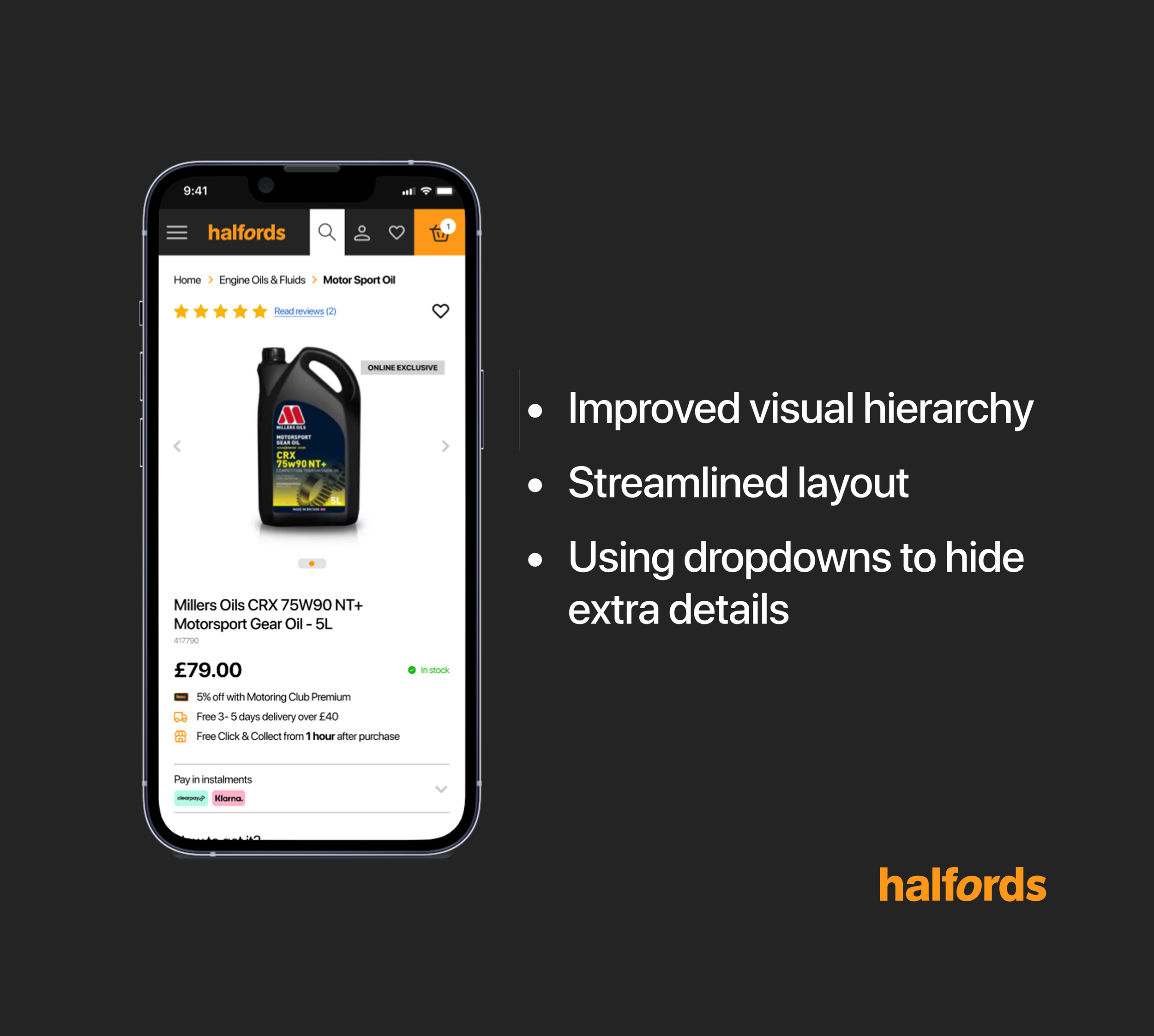
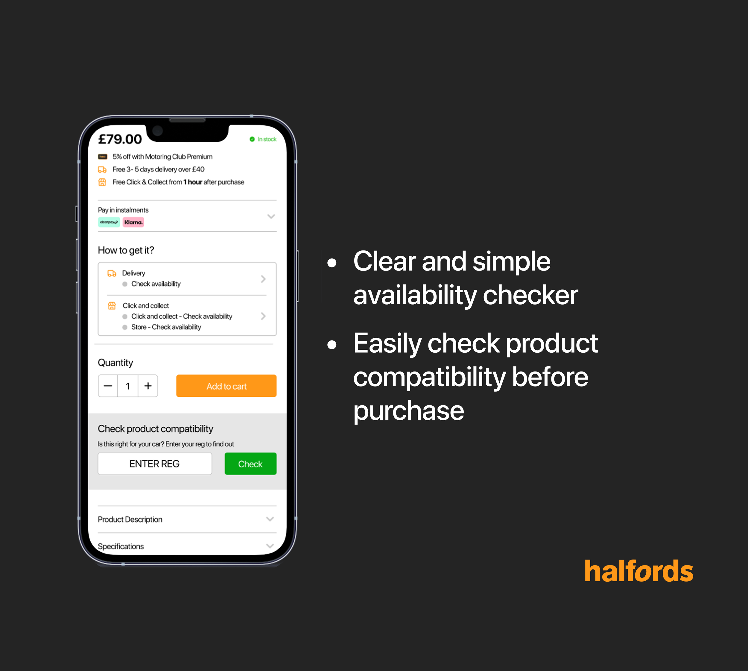
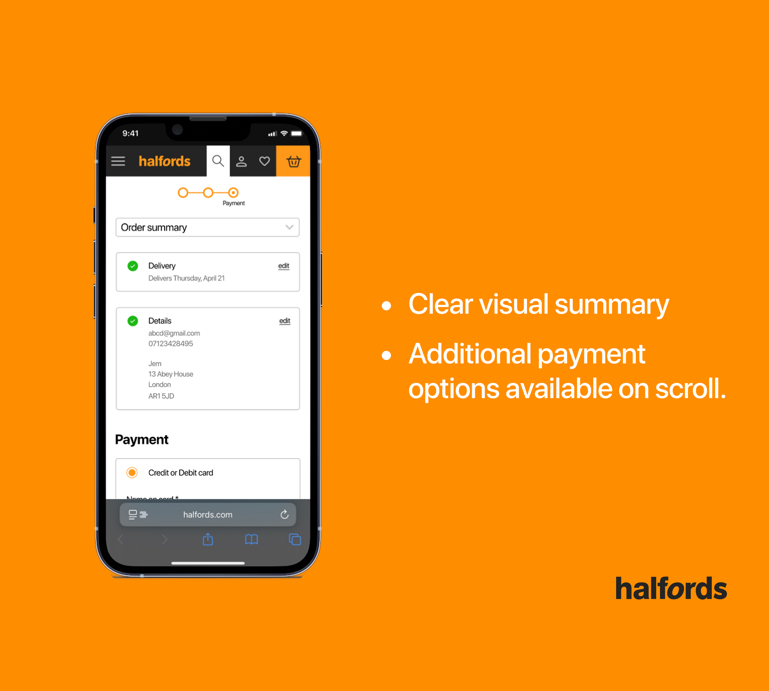
To better understand the scope of the problem, I began by researching the current state of e-commerce checkouts, industry standards, and emerging trends. A simple yet interesting pattern I discovered was the use of progressive disclosure, a design technique that shows only key information first, revealing more as needed. This approach helps break down content into easily understandable sections, reducing cognitive load and making the experience feel less overwhelming.

Testing the current design
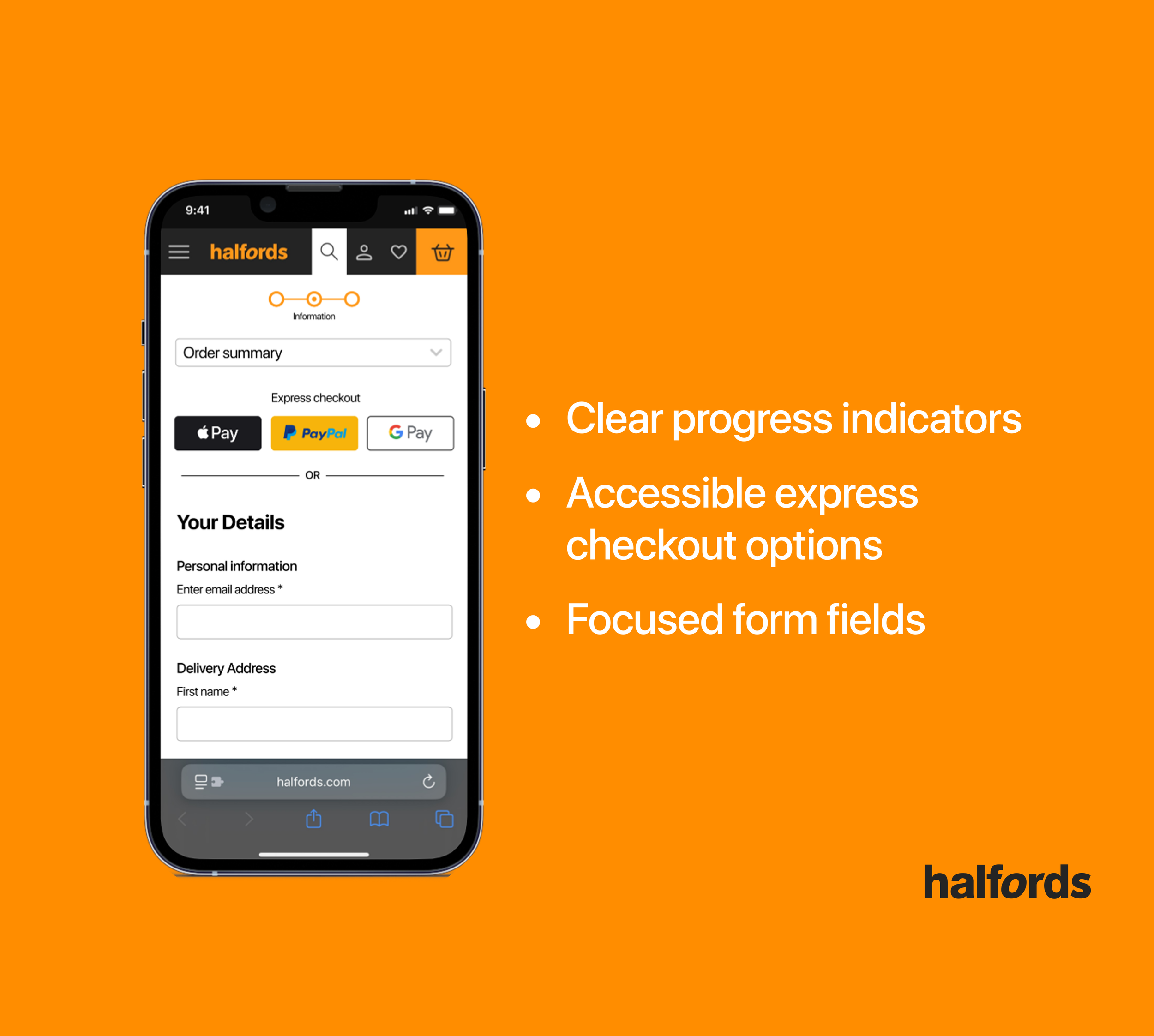
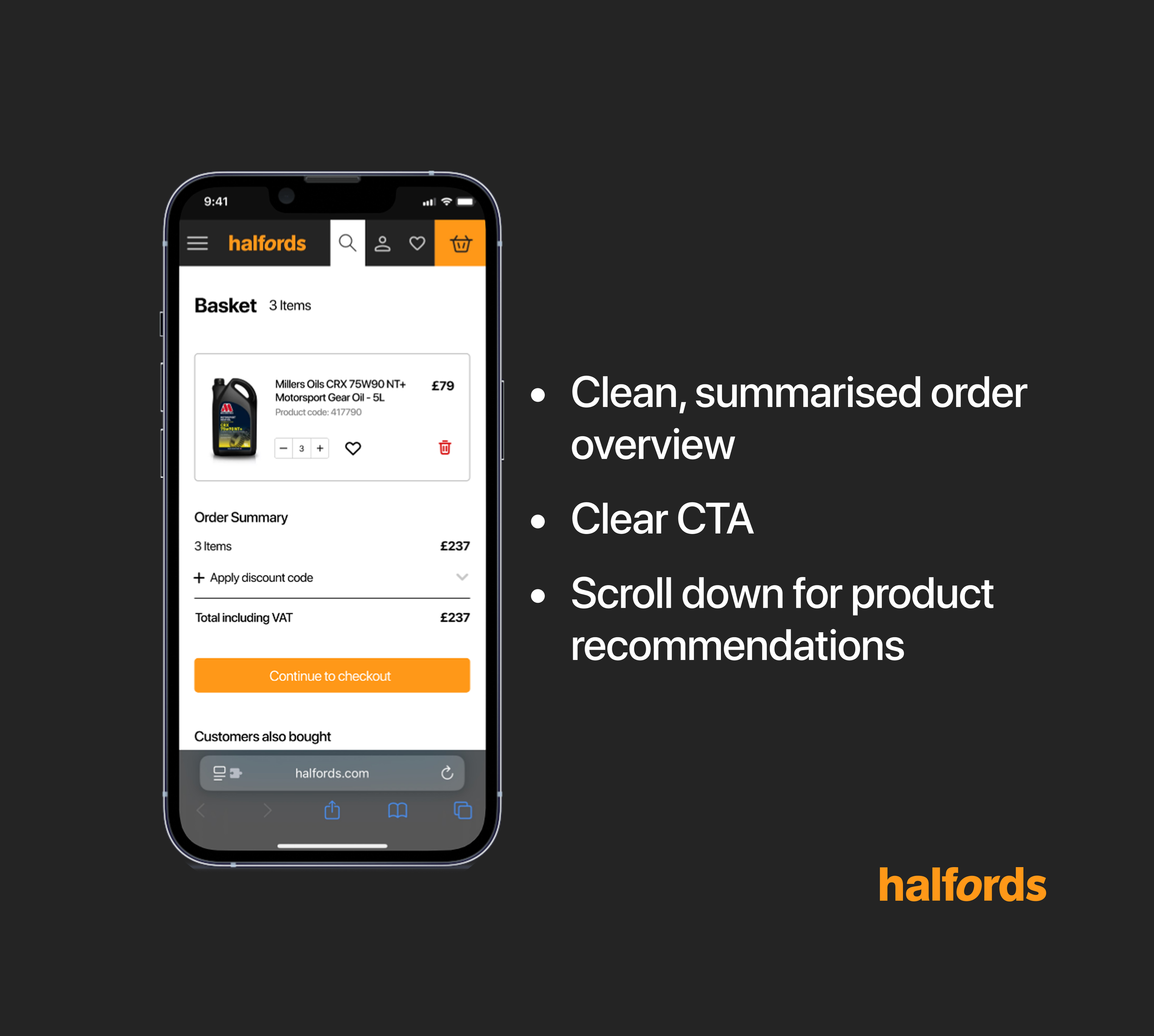
Following my analysis of the current website, to validate my findings I carried out 5 user tests. Key frustration from users highlighted: long unorganized pages, non-intuitive designs such as having to click “apply” after entering information, enter email address to proceed with guest checkout and a overall outdated design. Through affinity mapping key insights, I categorised the findings into three levels of impact, high, medium, and low, which helped me prioritise my design decisions more effectively.

The solution
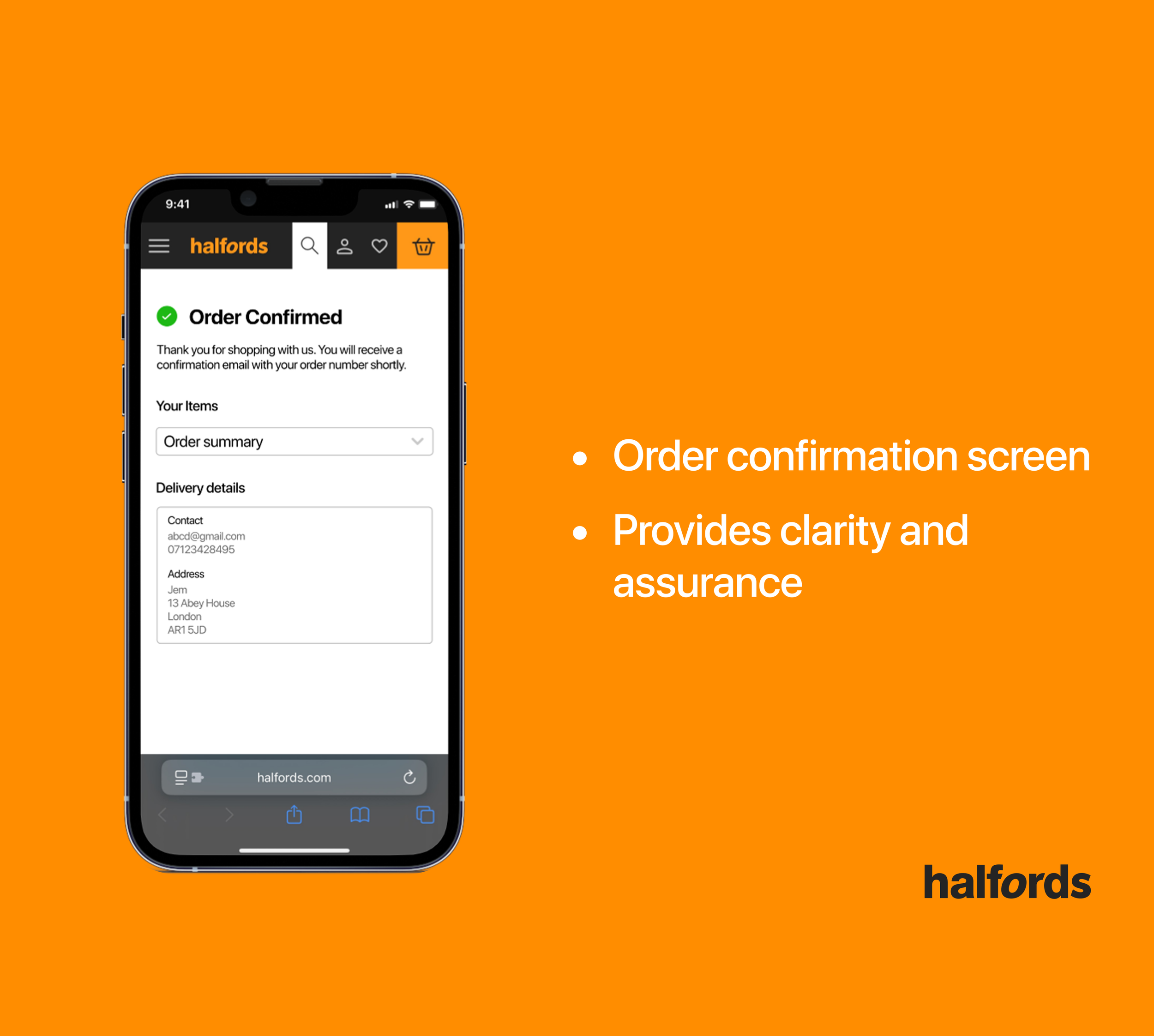
Referring back to my research, especially around progressive disclosure and what I learned from user testing, I designed solutions that directly tackled the problems users were facing. I focused on two key flows: checkout for delivery and checkout for Click & Collect

“It feels really long and unorganised”
Applying the principles of progressive disclosure - I created a dropdown animation for the order summary. This allows users to view their summary when needed, while keeping it hidden by default so they can stay focused on entering their details, helping reduce cognitive load during checkout.